Overview & briefing
The Circuit Board is a global network of specialist communications consultants connected by years of shared experience and a passion for great work. The team of journalists, PR consultants, social media experts, content creators, and strategists. To kick off the business, founder and managing partner Andrew Burton approached me to design a visual brand identity for the network.
Responsibility:
Graphic Design, Visual Identity, Print matters
Graphic Design, Visual Identity, Print matters
Tools:
Processing, Adobe Illustrator, Photoshop, InDesign, After Effects
Processing, Adobe Illustrator, Photoshop, InDesign, After Effects
Concept & result
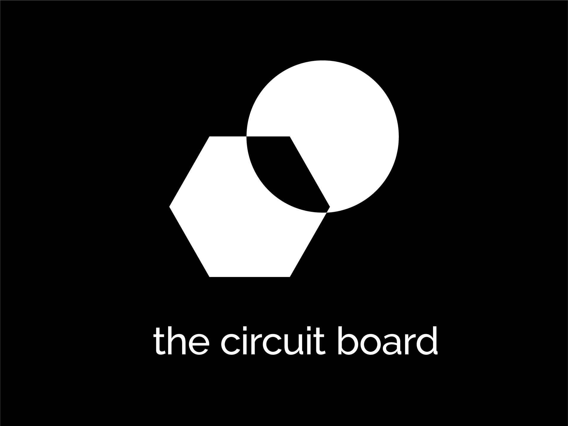
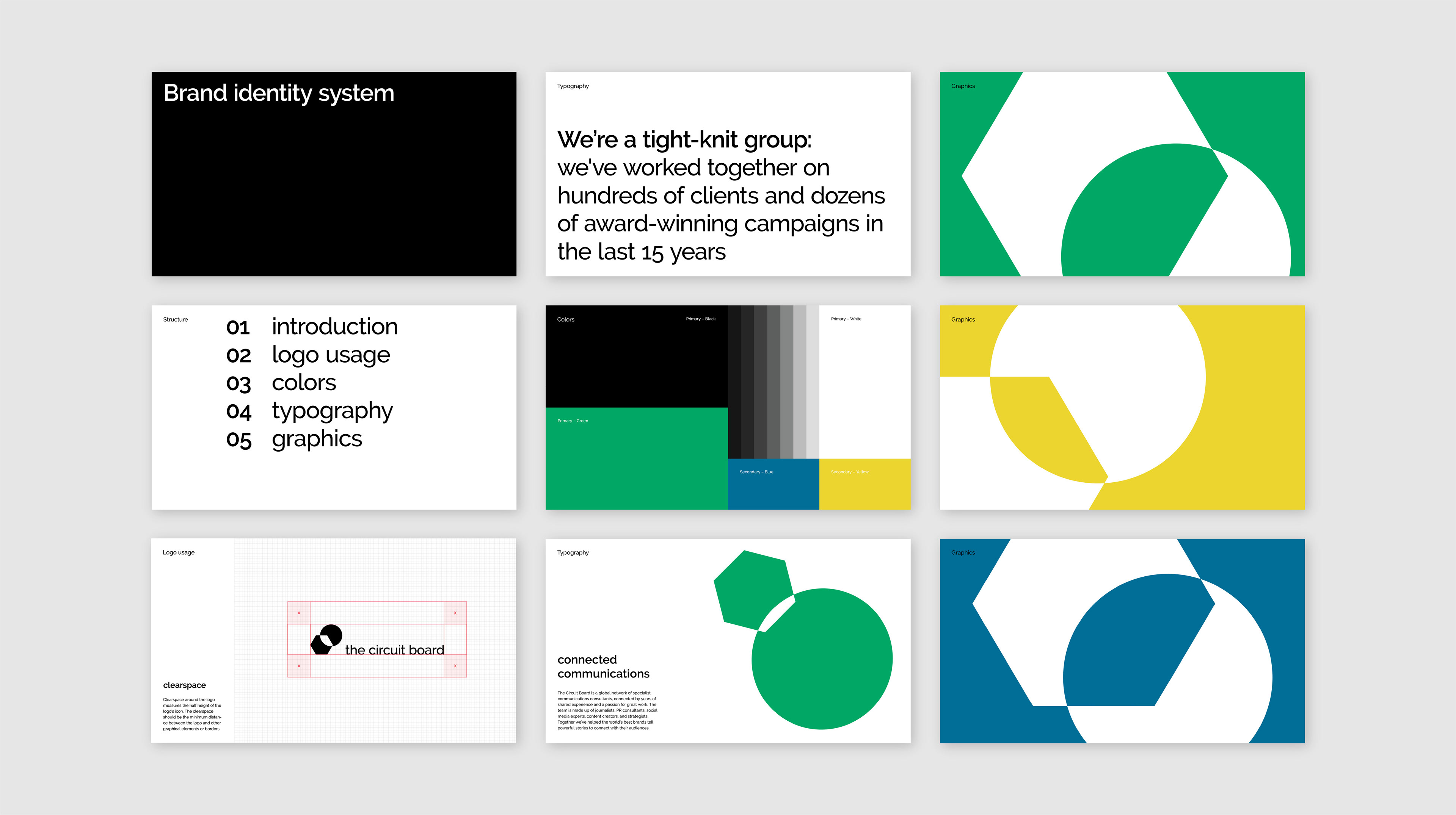
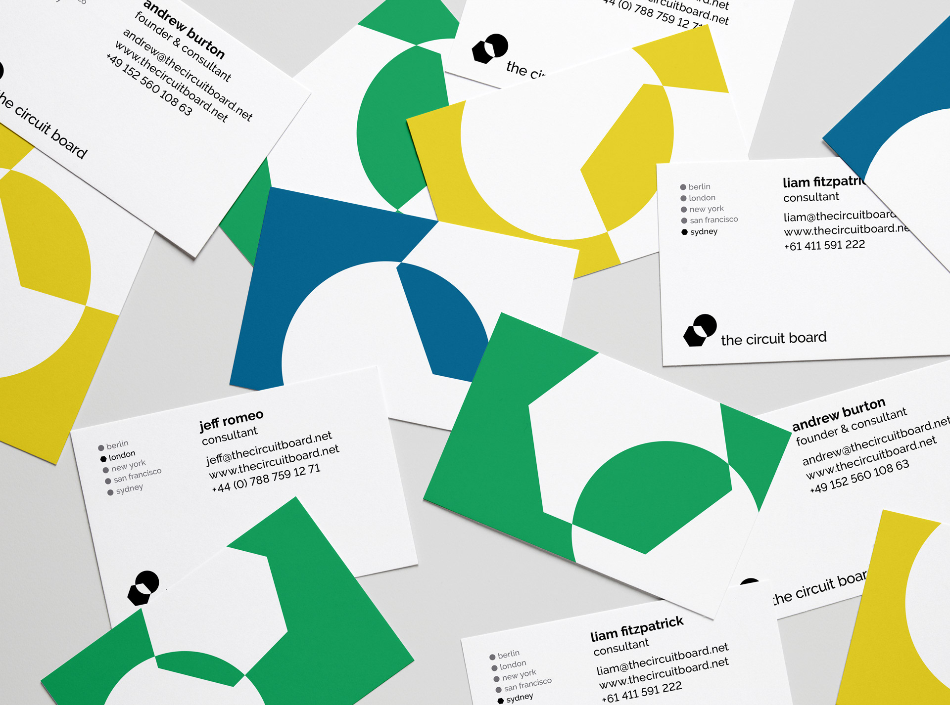
As The Circuit Board's name is entirely figurative, there was a clear starting point to develop a visual concept. To reflect the circuit board's look and feel, I chose bold primary colors and geometric shapes as the fundament of the identity's aesthetic.
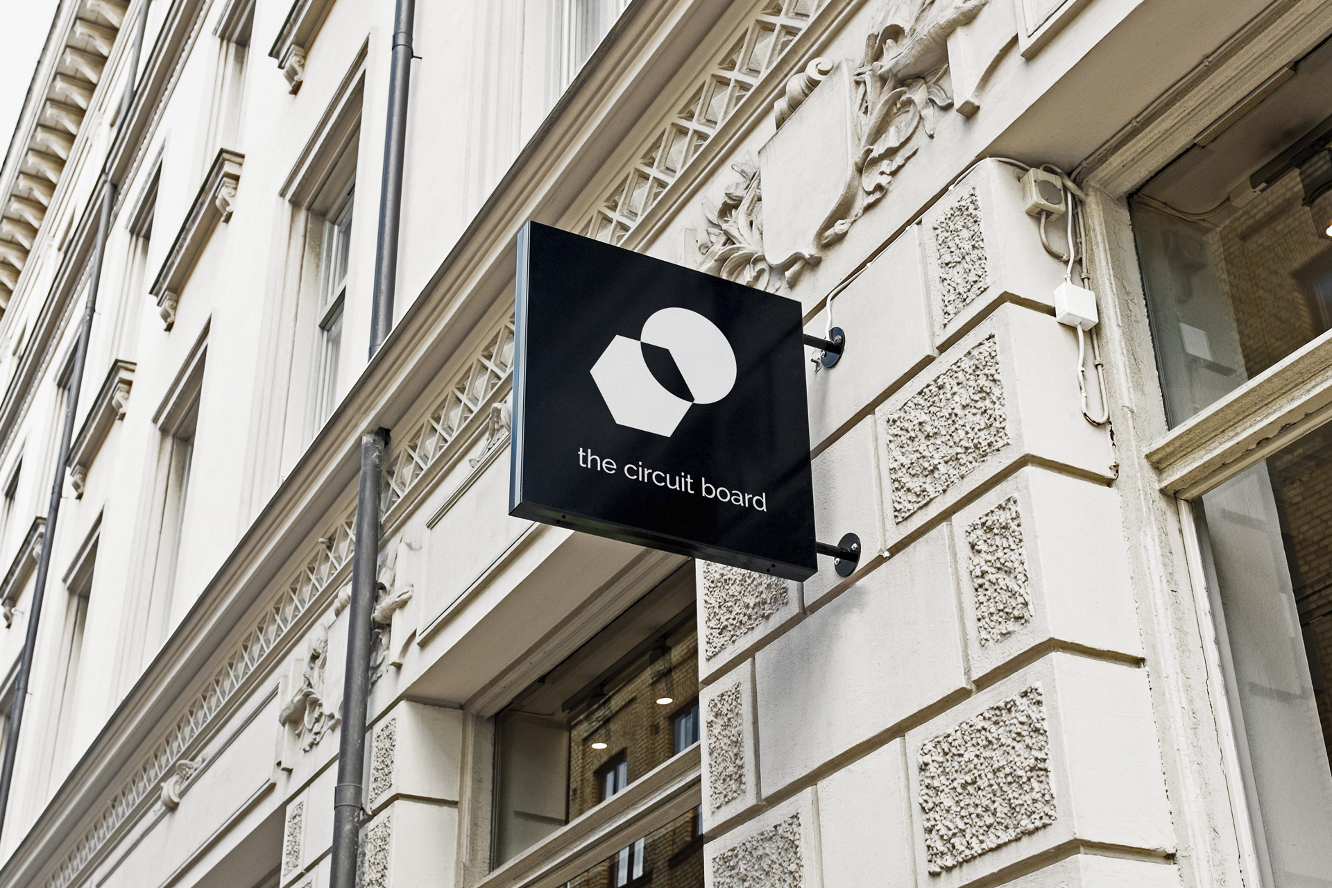
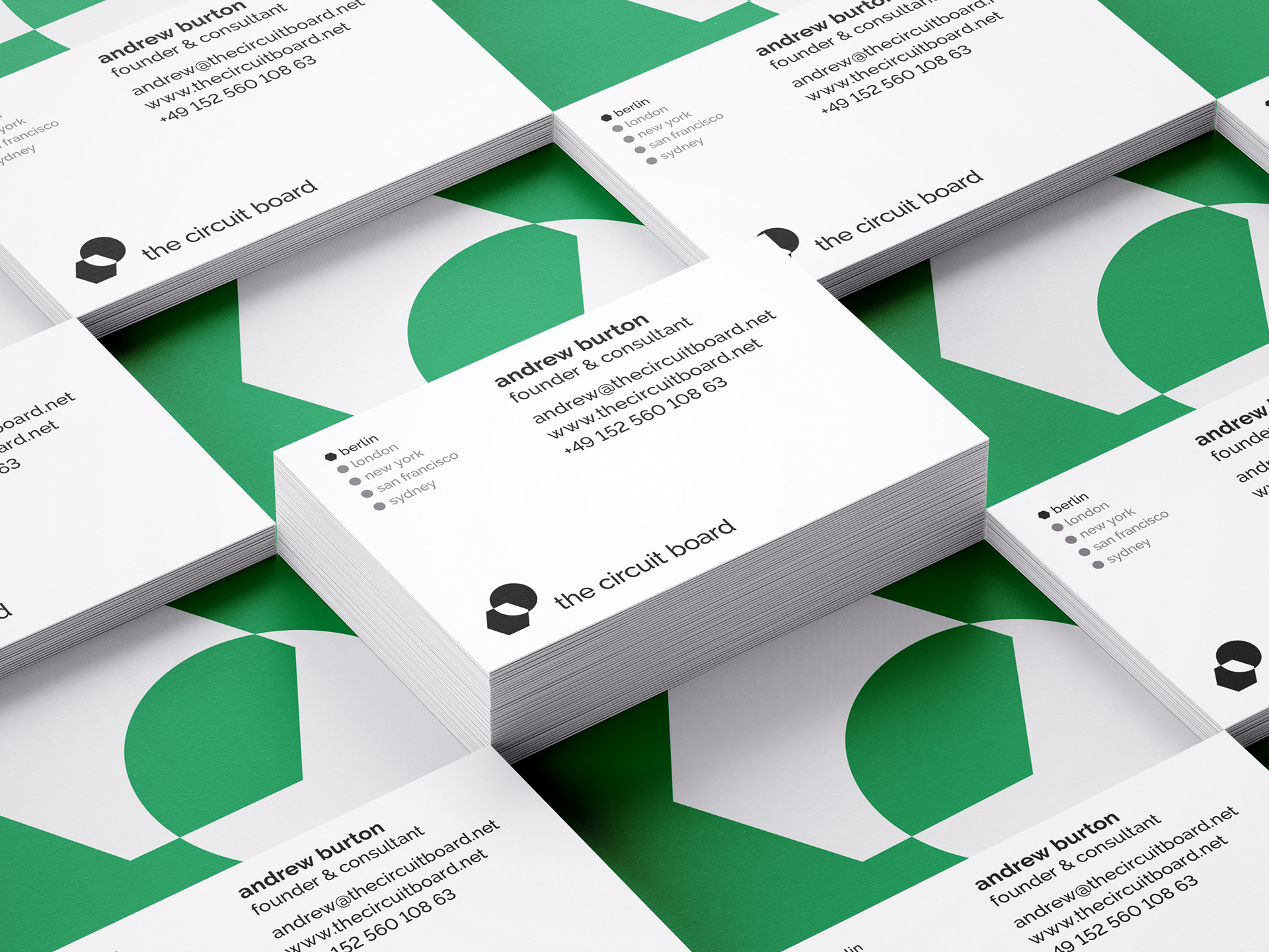
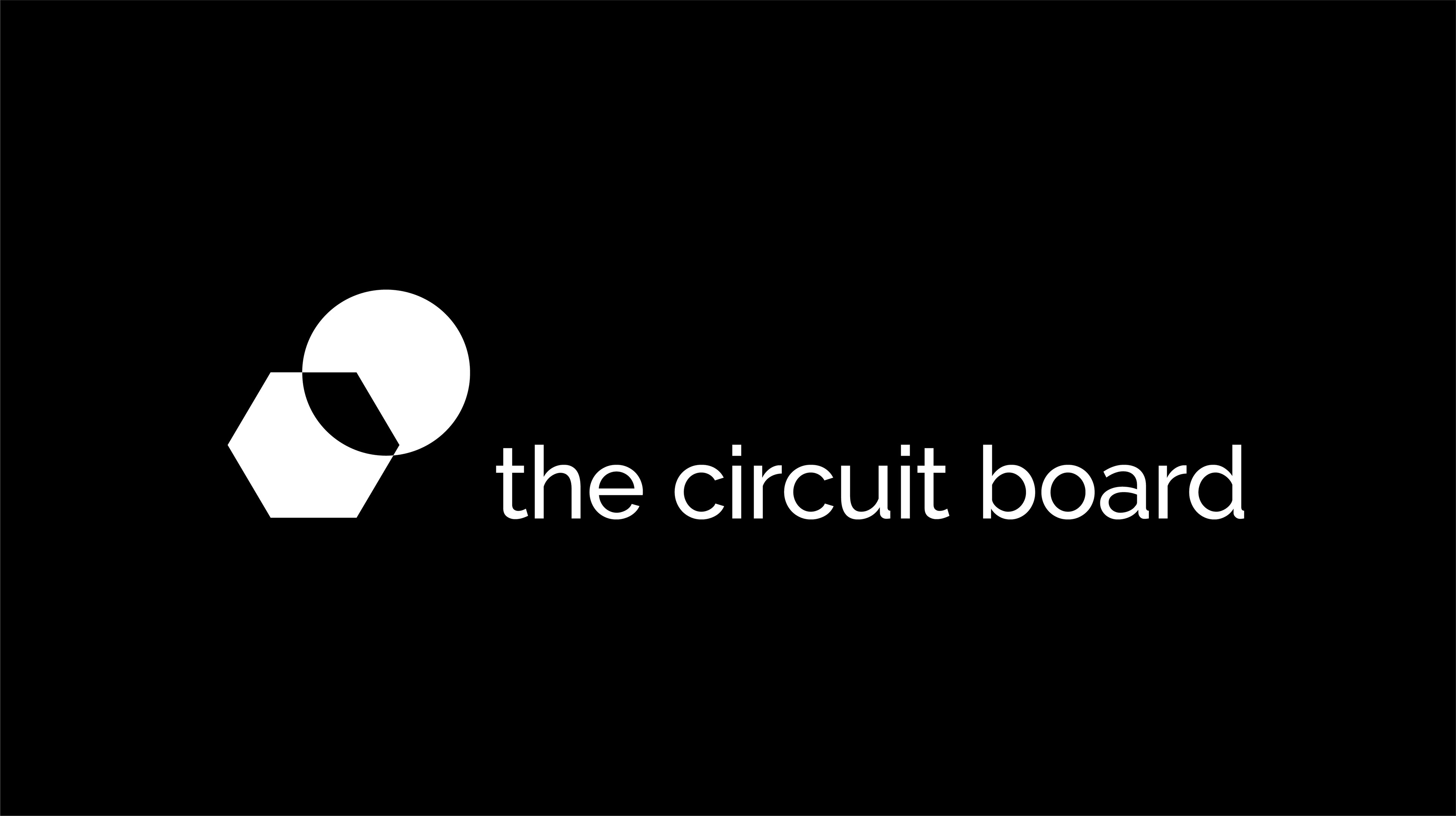
To represent the agency's wide-ranging expertise in technology and lifestyle, I translated these fields into visual language. The hexagon shape symbolizes the technology extreme, while the circle represents the organic and lifestyle parts. As a result, the logos icon became the synthesis of both shapes - an overlapping hexagon and a circle.
The elegant sans-serif typeface, Raleway, was a perfect fit for this design approach; it was geometrically inspired and characterized by the contrast of round and sharp shapes. Another typifying element of the visual identity became the usage of lowercase initials inspired by the typographical appearance of code and programming languages.
Through a kinetic exploration of circles and hexagons, I created different patterns that would serve as visuals for other brand assets. As a result, I designed the logo alongside a brand identity system, business cards, infographics and animations, keynote templates, and a website concept for The Circuit Board.